
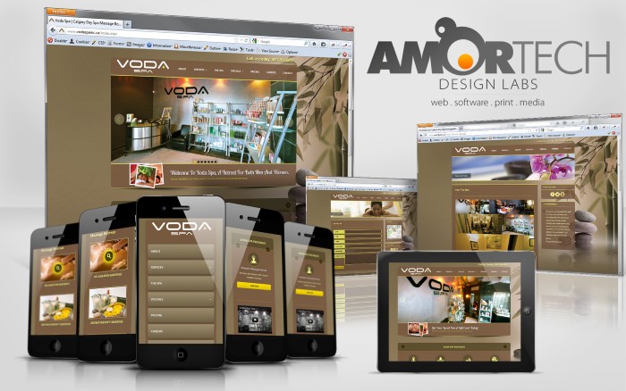
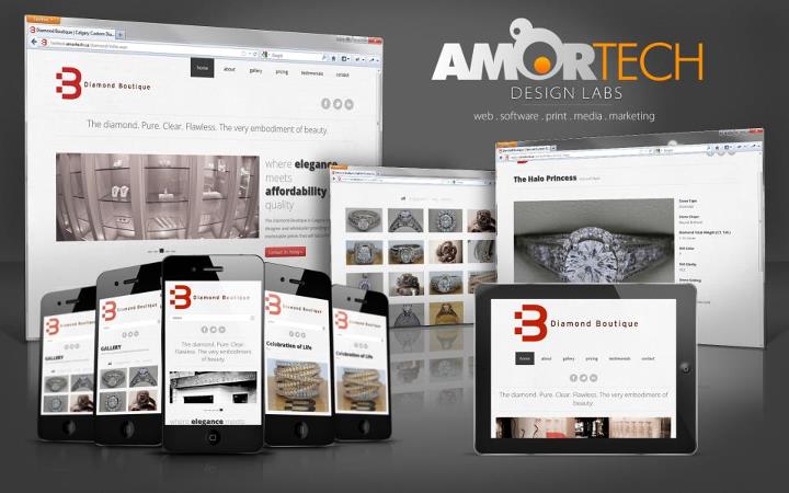
Now that multiple devices exist that allow you to browse the internet in all its glory, its time for developers to adjust and start optimizing their sites for all methods of browsing. 5 years ago, and still to this day, the task of rendering pages properly across all major browsers is a necessity. However, the shift from putting focus strictly on desktop browsing is now on layout and design. Whether you’re viewing the site at a full screen desktop resolution, or a handheld device such as an iPhone or android, the way the page renders can be completely different. Ignoring the scaling down of resolution will leave your page looking congested and scrambled, in most cases not looking anything like the original layout was meant to be. We at Amortech Design Labs have been designing web layouts which render beautifully on all platforms, as we see the importance in our clients customers being able to view their web page on any device.
To make your site responsive means to render the layout appropriately under all resolutions. A breakdown of the resolution sizes are as follows:

As you can see, the range of resolution varies greatly, from a desktop with a high end video card and large monitor, to a handheld device such as an iPhone or Android phone. When designing a layout for your site, there are 3 core parts you should incorporate in the design:
- 1. A flexible, grid-based layout
- 2. Flexible Images and Media
- 3. Media Queries
Flexible Grid
When initially laying out the design for your page, it is wise to consider the design as being blocks within a grid. Each block will be a div container which can be stylized and have its size set. You should initially have the layout designed for a desktop resolution, but continually plan on how the divs will rearrange when resizing occurs, and plan for a vertical layout for when the page is viewed on the handheld devices.
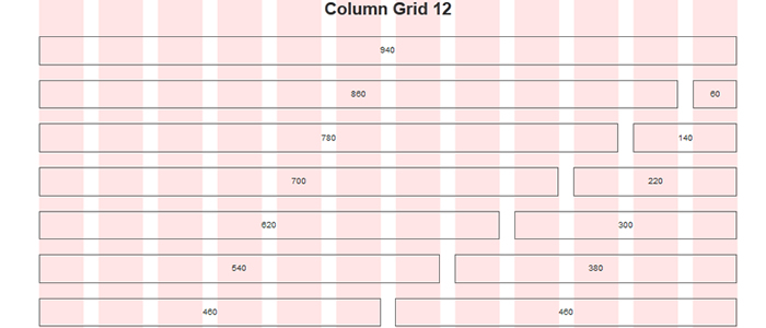
An important tool we at Amortech like to use is the 960 Grid System. This CSS provides us with a framework where the div containers are already set, and allow us to format the cells as we need. If used properly, the divs will be defined within a container, which will have a set size to it. Each separate call will have its own specific sizing, which will render within the parent container. Scaling down the site for the desktop, down to the lowest desktop resolution (800×480), the grid system will remain in tact, with spacing and sizing responding and rendering properly.
Flexible Images and Media
When placing images into your site, it is wise to use a higher than expected resolution, to ensure you don’t get the pixelated effect on any of your images.
If you are attempting to load a background image on the page, there are a few different methods one can use to achieve this properly. Using CSS you’re able to define a background and specify that you don’t want any repetition of the image (incase the browser is larger than the full image and the image automatically tiles itself). To set this, one can make a call in CSS such as
Body{background:url(images/background.jpg) 200px no-repeat;}
This will set the image background.jpg to 200px wide and it will not repeat itself on browser sizes over 200px wide.
However, if you want to make it more dynamic, and have the background image resize itself dynamically to the size of the browser resolution, you can include the jQuery plugin Easy Background Resize. This will allow you to set your image in a short javascript code, and the library will handle it and resize it properly.
Now that the background image is taken care of, you must consider the actual images that will be included on the pages. You can declare the actual sizing of the image within the CSS markup, but be warned that setting a specific width and height may skew your image. If you are utilizing the grid system as defined above, than the width of the image can be set to 100%, and that will take on the full width of the grid container.
However, setting the size to 100% the containers width will render a much bigger than desired image once the resolution is lowered. To handle this, it would be wise to set a max-width or max-height on the image call within the media queries. It is also worth noting that certain browsers (IE6 and lower) do not support the max-width call. To handle this, one should save out another version of the image, this time being the size you want shown on the smaller versions of your page. To set the image in CSS, to allow for the container to load a different image dynamically, one can set a class or id to the img tag in HTML, than set a background-image in the CSS.
Media Queries
Media queries allow you to ultimately reposition and redesign the layout of the page for different resolutions. To include media queries in your CSS file, simply add these tags and include the specific class calls within each body.
@media screen and (device-width: 768px) and (orientation: portrait) { //body }

//iPad in Portrait mode

@media screen and (max-device-width: 1024px) and (orientation: landscape){}

//iPad in Landscape mode

@media screen and (min-device-width : 320px) and (max-device-width : 800px) {}

//Smartphone

@media screen and (min-device-width : 321px) and (max-device-width : 800px) {}

//Smartphone Landscape mode

@media screen and (max-device-width : 320px) {}

//Smartphone Portrait mode
Again, with the proper grid system in place, you are able to resize the parent container div to a set width, and since all the divs within the container have a percentage set width, they will resize accordingly. The grid layout will allow a responsive layout, however some items may still be disproportionate to the screen size. Elements such as font size, as well as specific font families will render blurry on small resolutions, so including a separate generic font family for text fields rendered in the smaller resolutions is wise.
Conclusion
We at Amortech have been busy producing various responsive web designs for our clients. Our pages render beautifully on all resolutions and are optimized for ease of use on all devices. Check out our gallery of past projects, and contact us if your business is looking for that competitive edge on online presence.


Recent Comments