A visual representation of your company is crucial for branding and making an impact on potential clients. Regardless of what industry your company is a part of, having a well-designed logo is a necessity. To create a logo that has the power to grasp the attention of the viewers, a few key points should be considered prior to designing:
- Stay focused on your direction. Whether you’re expanding on a previous version or designing a brand new one from scratch, you must remember what the logo is to represent. The identity of your company should be portrayed through whatever logo design you decide to go with.
- Browse logos of other companies in similar areas of business. You should be able to take from this what fonts work best, what colors are being over-used, and how you can make your own logo stand out from everyone else’s.
- Don’t clutter your design by packing too much information into a small space. Remember, a logo is meant to represent your company, not define it. Keeping it simple allows for viewers to easily remember your brand as well as it will allow for you to scale it to fit neatly on many different mediums.
- Don’t choose a trending theme to use for your logo only because it’s popular at the time. The best logos are timeless, and need minimal (if any) change throughout their life span (think Pepsi).
With those simple guidelines defined, you are now able to start considering the overall type of logo you want to explore. There are three types which encompass all logo designs.
Logo Types
Pure Text
First there is the Font-based logo, which is entirely done through use of texts. Though some may consider a font-based image not truly a logo, you must consider the power that simplicity holds. Take for example Phil & Sebastian’s Coffee Shop. Their logo contains plain bold Arial font which is black and has a distinctive blue high to the & symbol. Their logo is elegant and simple, yet powerful and unforgettable.
Text & Symbol
The next type is the combination of font and text, which allows for newer companies to give definition behind their name so viewers are able to better understand your company. For new companies with no history, a simple text logo with your name is hard to implement. Unless your name is recognizable, or it consists of the industry you are a part of, the viewer will simply not understand what your company is about.
Symbol Only
The final type is (obviously) utilizing only symbols in your logo. This is a hard task to implement for new companies, since images are always up for different interpretations. Unless the viewer previously knows your company, or the images used portray exactly what your company is about, then your logo is open for multiple interpretations.
Sketch
Now that you have decided on the key issues behind designing your logo, you are now able to start working on it. Before investing time into designing your logo on the computer, start by hand drawing your ideas, trying different ideas and seeing what is most visually appealing to you. This will allow you to see early on what works, what text you will want to include, and what symbols work best given the text. Once you have a rough idea of what you want your logo to look like, you can start designing it digitally on your computer, and perfecting the finer details. At Amortech we use Adobe Illustrator in all our design processes, since it is a vector based program which will allow us to easily modify the sizing of the logo once it is complete, without losing any quality. Through Illustrator you are able to export your image in all major image file types such as PNG and JPEG for use in production, and Ai and EPS for use within these applications for further editing.
Colors
After the design layout is complete, you are ready to work on the colors. The choice in color is very important since you want your logo to stand out, but not show ago and become dated (like Apples logo from 1985). The over use of colors is dangerous, especially when using multiple bright/neon colors. Remember you want your logo to be unique, not ugly! If you are unable to decide on a color, or you want to rely on the strength of imagery and less on the colors you chose, utilizing gray scale will allow for a very powerful look.
Aspect Ratio
The last step when designing your logo is to consider aspect ratio and sizing of your logo. Now that handheld devices with minimal screen space are being utilized to view websites, you must consider the display size of your logo and how it will appear on all devices. If you are using a combination of symbols and text for your logo, you could utilize just the symbol out of your logo when displaying on smaller devices. Without distorting the look of your design, try resizing your logo anywhere from a 64×64 image to a full screen size. This will allow you to be confident the look of your logo will remain static from the smallest of renders to a full screen background.
Amortech Conclusion
Our Calgary graphic and logo designers encapsulate every aspect of this design process. For the best results, we attempt to gather as much information from our clients in regards to sketches, colors, icons, themes and more to unsure the PERFECT fit for your company.
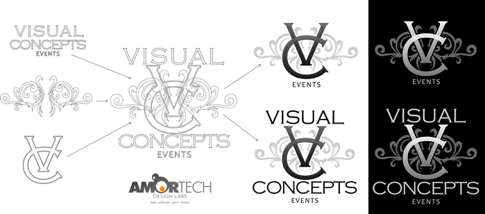
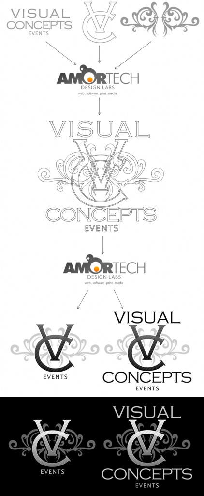
Below is an example of our design and thought process when designing a logo:
At Amortech we have been able to work with many exciting companies and come up with unique branding that has been used all over the globe. Our branding specialists have what it takes to give your company the precise image you are looking for.





Recent Comments